baks & co
Brand Identity
baks & co / Consid communication
My role: Art direction & design
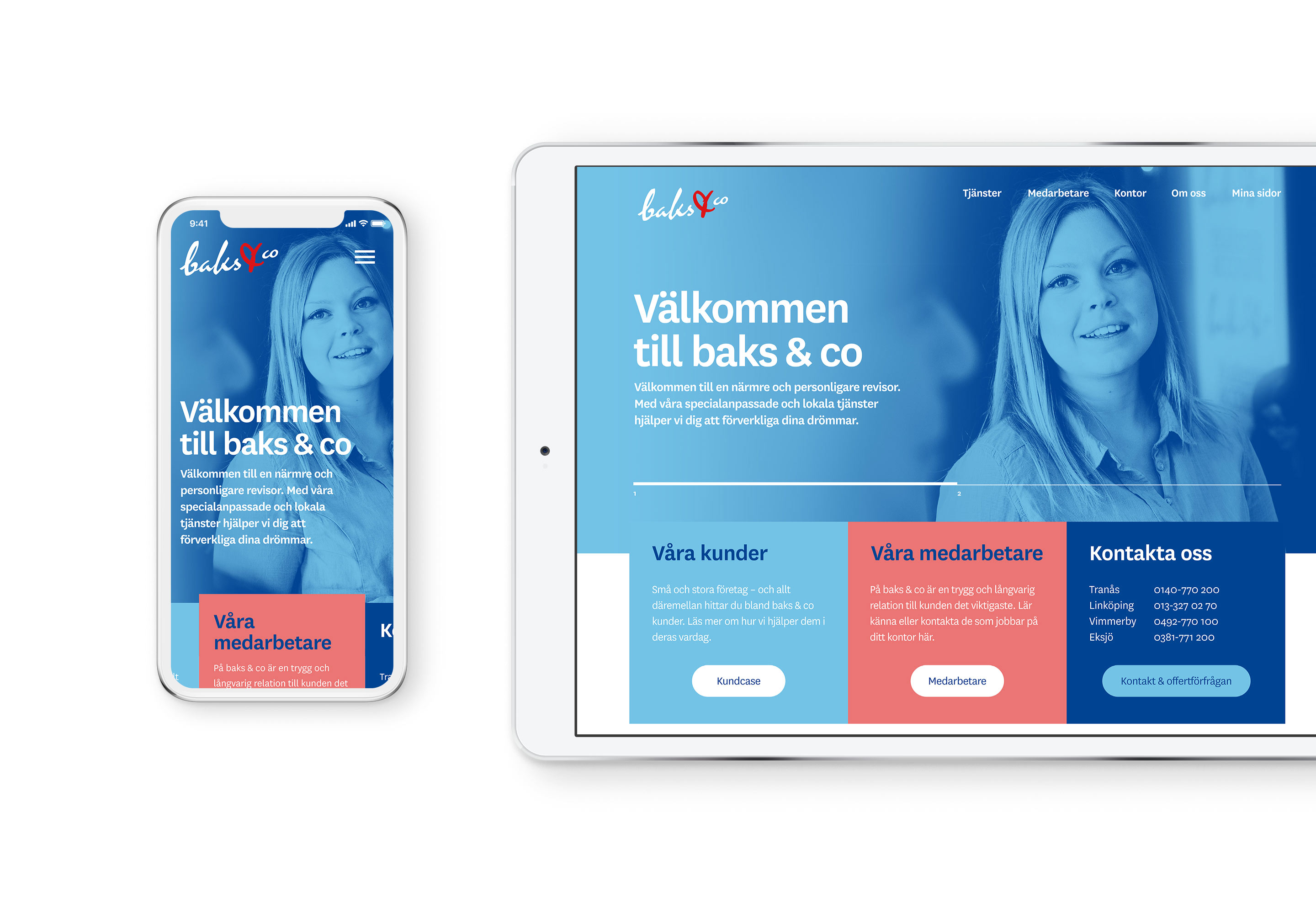
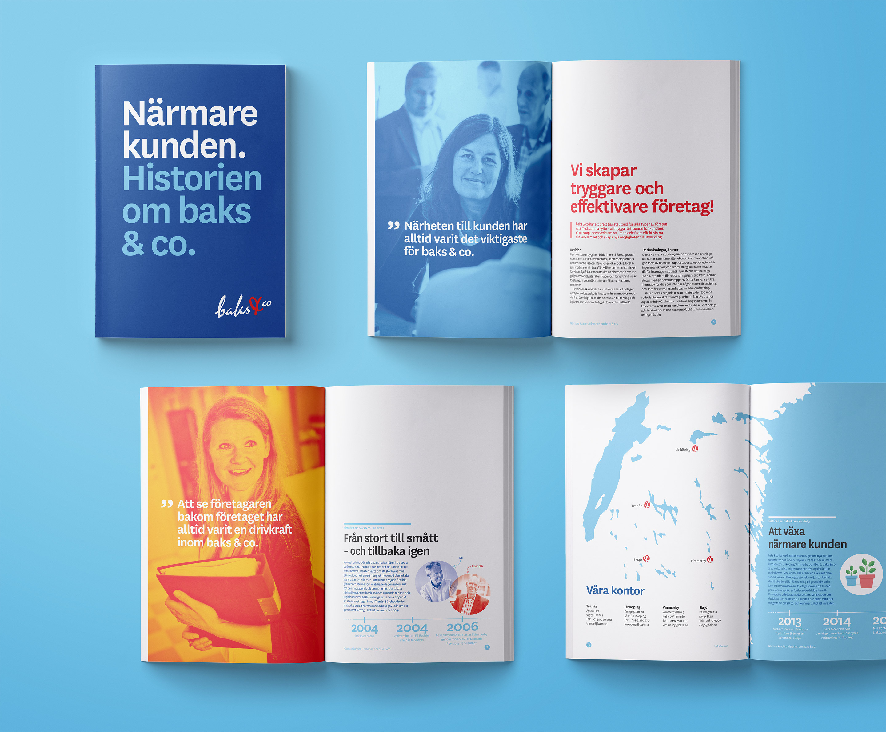
baks & co was founded by Bo and Kenneth who had become tired of the stiff and unflexible services offered while working at the large accounting firms. They wanted to create something more in tune with the spirit of the local businesses they worked with and knew so well. To help them stand out againts the big firms, we wanted to show how baks & co bring their personality to the job and cooperate with their clients.
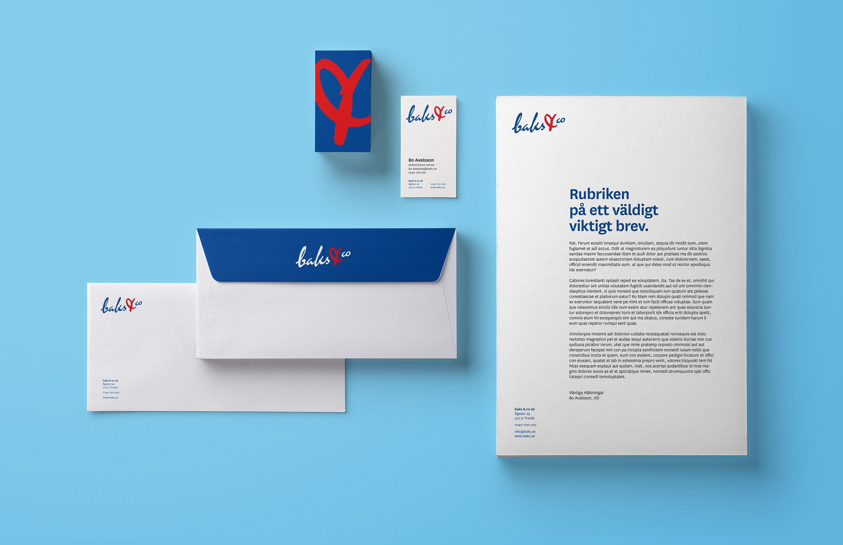
Logotype
baks & co's old logotype was set in Mistral – it felt dated and in need of an update. But since it was dear to the owners we drew a sharper, more legibe version allowing for an easy transition to the new manual.
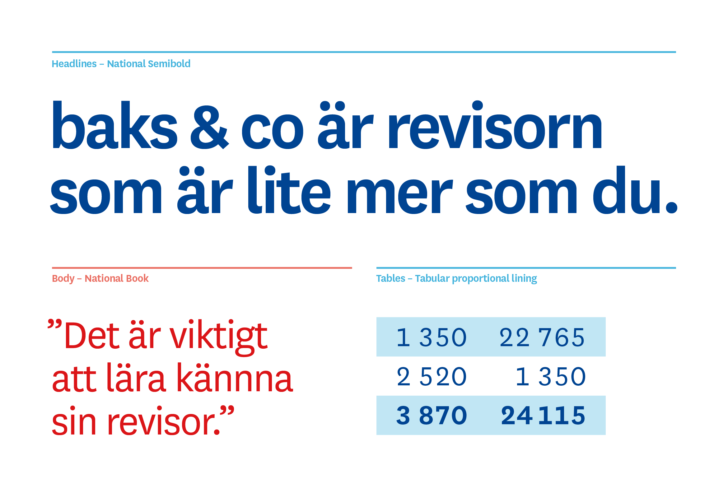
Typography
The typography relies on National and its versatile character set. A friendly and humane, yet useful san-serif.
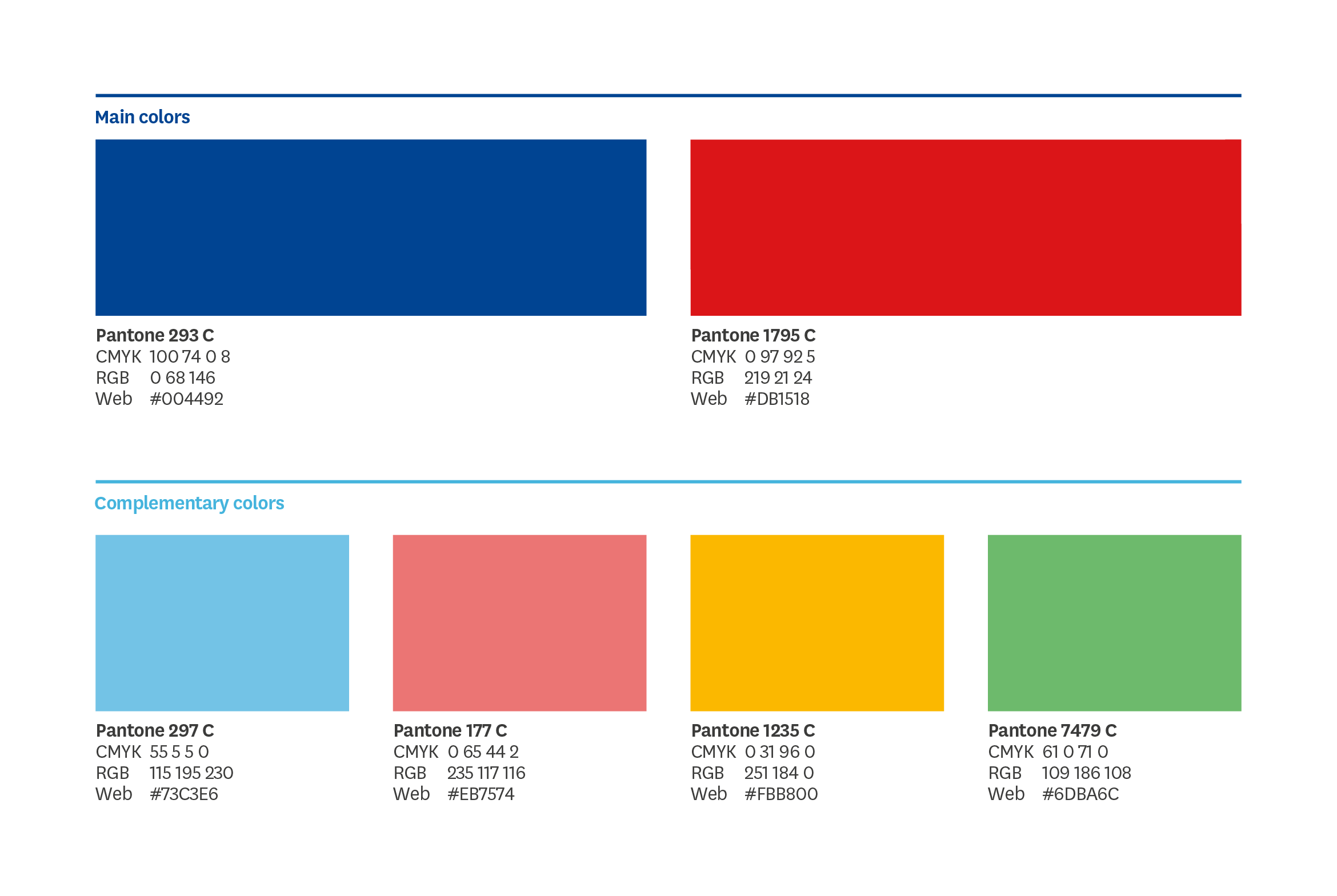
Colors
A bold and vibrant color palette was chosen based on the interiours of the baks & co offices.
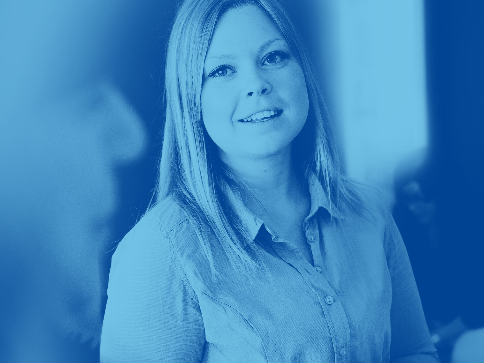
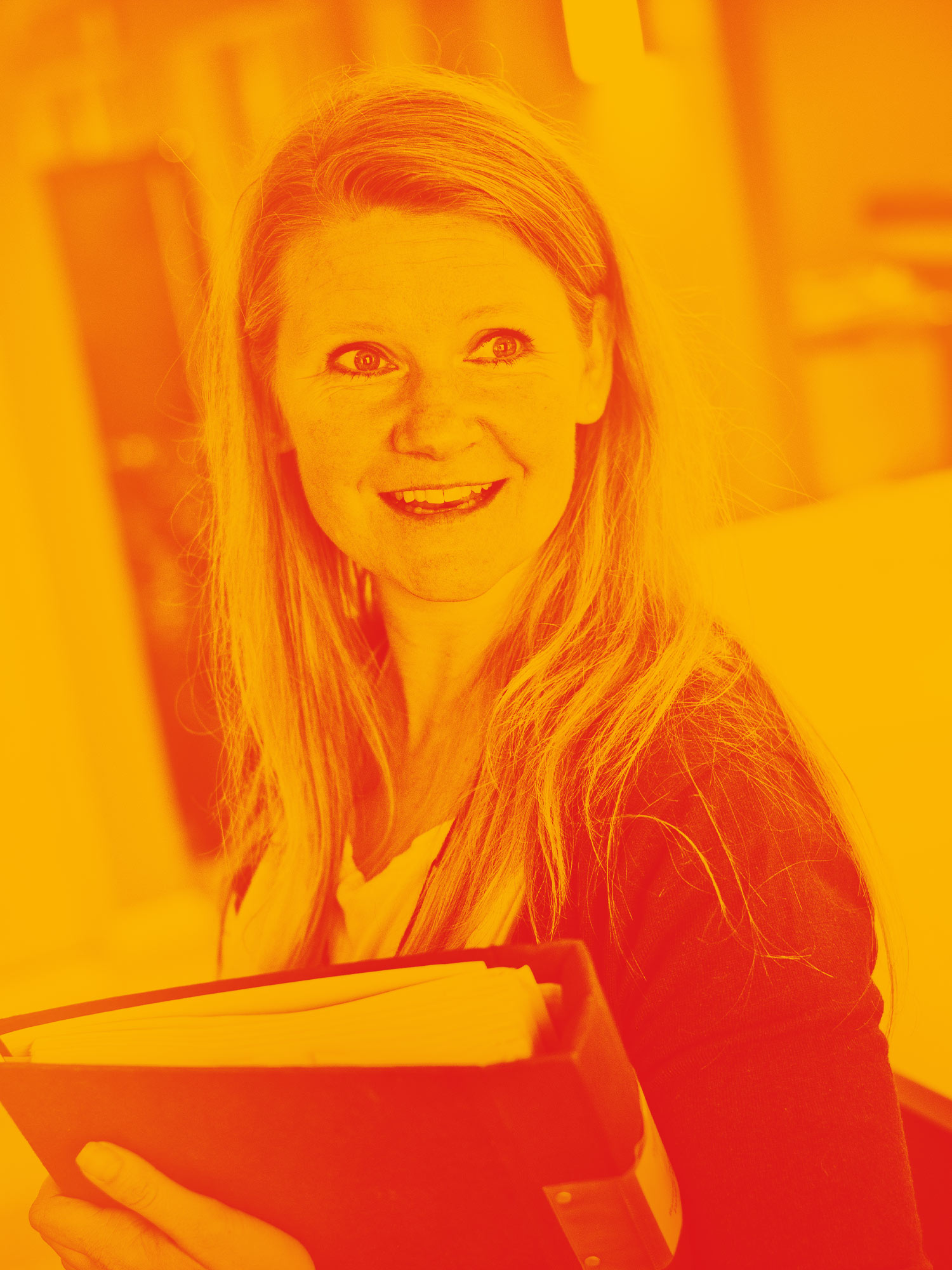
Photos, filter and style
The employees of baks & co are the most important part of the brand. We wanted to let them carry the brand with a diverse colour pallet and personal, in the spur of the moment photography.


More projects
WISE MaterialsBranding, designsystem & interactive design
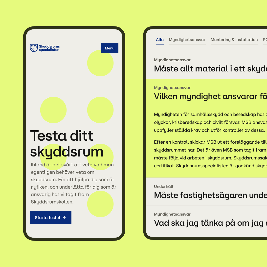
The Shelter SpecialistDesignsystem & interactive design
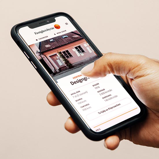
FastighetsbyrånDigital design & design system
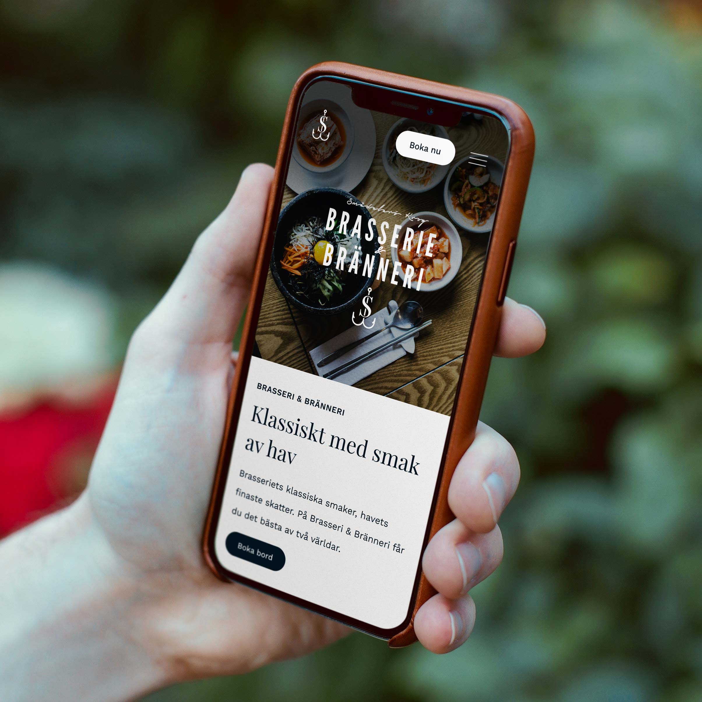
Smådalarö GårdWebsite
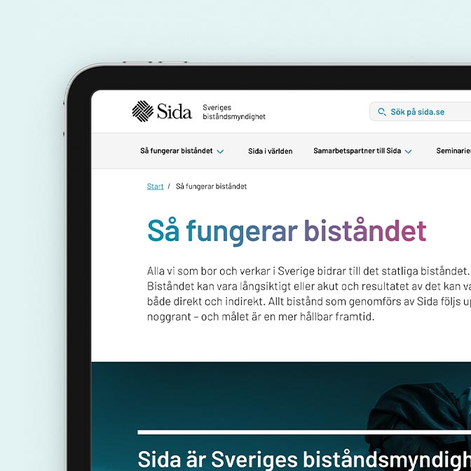
SidaInteractive design & design system
The IIPersonal project
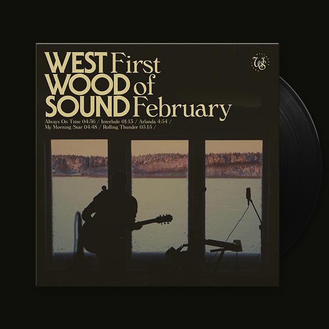
First of February EPCover artwork
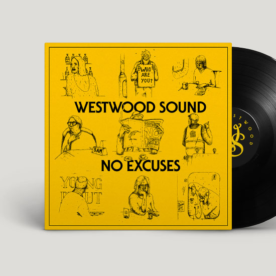
No ExcusesCover artwork
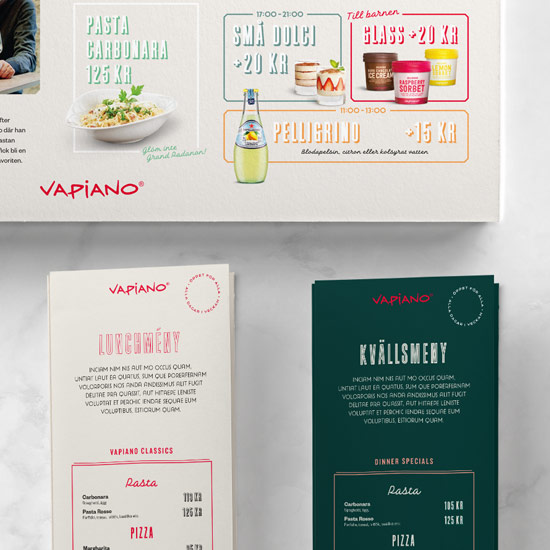
VapianoBrand revitalization
Studio Smedenborn AB